Smartphones
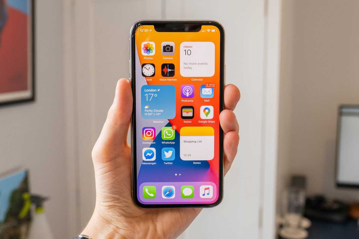
First impressions of iOS 14 public beta and your iPhone’s new home screen
The iOS 14 public beta is now available for iPhone and iPad

The iOS 14 public beta is now available for iPhone and iPad
Just a couple of weeks after unveiling iOS 14 at its online WWDC event, Apple has now made the new iPhone and iPad operating system available for everyone to download as a public beta.
One of the biggest updates in years, iOS 14 finally unshackles the decade-old iPhone home screen design, introducing widgets and a new way to organize your applications.
Read More:
There are also changes to how Siri looks, and how call notifications appear on the screen, plus a huge number of tweaks and new features add to the Maps and Messages app. It's safe to say, there is an awful lot to digest here.
But, as always at this time of year, we urge readers to proceed with caution. Although available for the public to download, this is still very much a piece of beta software. This means it is still in development, is not finished, and is likely to contain bugs, glitches, and other performance issues. Apple might also decide to make some major changes, or even remove (or add) entire features before iOS 14 is released as a finished piece of software in the fall.
As such, we remind readers that they shouldn't install iOS 14 on their one-and-only iPhone or iPad, as some applications might not work. The MacRumors forum maintains an exhaustive list of applications that do and don't work with iOS 14, which is regularly updated. Please check there first to make sure your most-used apps are known to work.
I've been using iOS 14 for the past week or so, and here are my first impressions of the change Apple has made to the iPhone's new home screen.
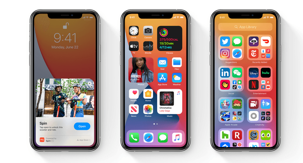
First of all, having installed iOS 14 you won't notice any major visual changes at all. Your home screen isn't suddenly full of widgets, as Apple wants users to work that out for themselves. To add widgets, press and hold anywhere on the home screen (but not directly on an app icon) until your app icons start wobbling. Apple calls this 'jiggly mode'.
Now tap on the + icon in the top-left corner to add a widget. The list you are presented with includes widgets for showing photos, the weather forecast, newly downloaded podcasts, news headlines, stock prices, battery levels, calendar events, Screen Time stats, and much more.
Tapping on any of these then shows what sizes the widget is available in. Most have three options, which take up space of your home screen equivalent to four, eight, or 16 app icons. Once you have picked the size you want, tap 'Add Widget' and it's ready to be placed on your home screen.
There is also the option to add a 'Smart Stack' widget. These are the size of four app icons in a square 2x2 layout or eight (four icons wide, two icons tall), and intelligently show different widgets depending on the time of day. For example, your calendar might be shown first thing in the morning, then podcast episodes you haven't yet listened to will show up in the evening.
Widgets are only available on a first-party basis for now, but you can expect to see third-party options appear in the fall. This could mean widgets for your commonly used apps, like Instagram, Twitter and Gmail.
Adding widgets to your iPhone home screen will probably feel daunting at first. If you're anything like me, you will have positioned your app icons to perfection and acquired the muscle memory to tap on them without looking.
But change can be a good thing, and by adding three 2x2 widgets to my home screen I forced myself to think carefully about which apps I wanted in the remaining 12 spaces (plus four in the dock), and which got relegated to the second page and new App Library (more on that shortly).
I also think the simpler home screen looks great, with the colorful apps and widgets working well against iOS 14's bright new wallpaper options. Forcing myself to try this new layout meant realizing how few apps I actually use on a daily basis, and how many I had neatly stored in folders for no reason other than to be aesthetically pleasing.
As an additional note, widgets cannot be placed with empty space around them, as they can on Android. They instead snap into place among your app icons.
With the home screen perfected, it's time to head to the next page. You can fill this with more apps, widgets and folders if you like (I have eight folders filled with most of my other apps, and nothing else). Or you can remove them all.
New for iOS 14 is the option to remove an app from the home screen, but not delete it from your iPhone. To do this, long-press on an app to enter 'jiggly mode', then tap on the minus icon. This would normally delete the app, and the option is still there, but now you can instead tap 'Remove from Home Screen'.
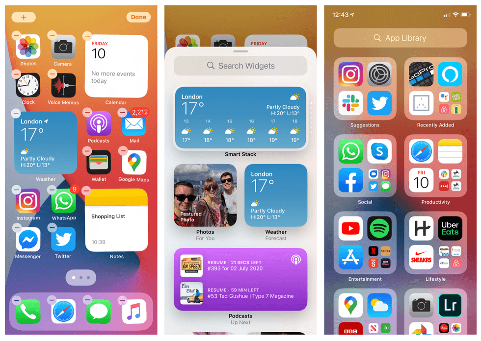
This does exactly as it says, but instead of disappearing entirely, the app (along with all others you have installed) lives permanently in the new App Library. This page appears to the right of your last home screen page, and will be familiar to Android users, especially if you tap on the search bar at the top, which opens an alphabetical list.
Here, your apps are automatically organized into folders based on what they do. There are categories like Health & Fitness, Entertainment, Utilities and Social. iOS 14 mostly gets this categorization right, but there are some gaps. For example, airline apps get dumped into the Other folder instead of getting their own called Travel. I was also disappointed to see some smart home apps like Awair, Hue and Amazon Alexa fall into the Lifestyle folder, alongside Airbnb, Amazon and Uber.
There is no way to edit this, which is a shame. I hope that function is added as iOS 14 progresses through beta development.
If the App Library page becomes editable, I can see myself deleting all of my own folders, then simply having the home page with widgets and a handful of apps, and use the App Library page for everything else. What's more, now Apple has made improvements to the Search tool (found with a downward swipe on the home screen) I've found myself using that more for searching and then opening apps.
Finally, widgets can also be added to (or removed from) the Today View page, which is the one to the left of the first home screen. This page feels a little redundant now widgets can be placed anywhere, but if you don't want widgets among your app icons, you can arrange them all here instead.
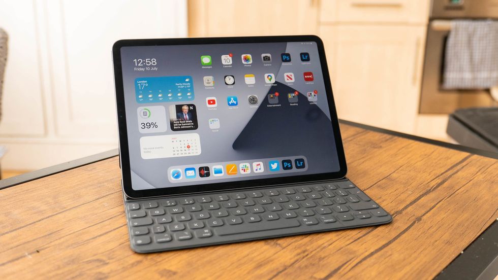
As an aside, iPadOS 14 does not allow widgets among the home screen app icons. Instead, they can only be added to the Today View – but remember, with iPadOS this can be set to take up the left third of your home screen when viewed in landscape, as shown above. There is also no App Library page in iPadOS.
Simplicity through complexity is the name of the game with iOS 14. The update has a great many other new features to explore, but I feel the home screen changes are the largest, and the ones iPhone users will likely spend the longest time getting to grips with.
For now, it will be interesting to see what changes (if any) Apple makes in the coming months, to both iOS and iPadOS 14, before the finished software arrives in the fall.
OtterBox Symmetry Clear Series Case for iPhone 11 – Stardust (Silver Flake/Clear)
GearBrain Compatibility Find Engine
A pioneering recommendation platform where you can research,
discover, buy, and learn how to connect and optimize smart devices.
Join our community! Ask and answer questions about smart devices and save yours in My Gear.
