The Conversation (0)
Ford
Ford Sync 3 review: A lesson in function over form
It might not be the prettiest, but that isn't the point
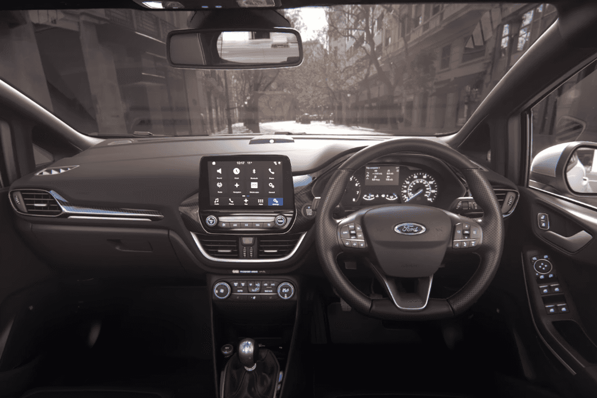
The infotainment system featured here is Sync 3, and specifically it is the system of a 2017 Ford Fiesta Vignale. We should say right away, the all-new Fiesta is not currently available in the US and our review was done on a UK car. However, while the dashboard may be unfamiliar to US readers, the Sync system and its user interface is the same as that offered on Fords the world over.
Ford Sync is the perfect example of function over form — and an example of how much the smartphone has changed our idea of what we think makes a good user interface.
When we first saw images of Sync 3 a couple of years ago, we thought it looked unfinished, a demo of how the system worked. Compared to car systems offered by its rivals, Ford's looked incredibly basic, unfinished and perhaps even a bit ugly; like it had been built for a school project.
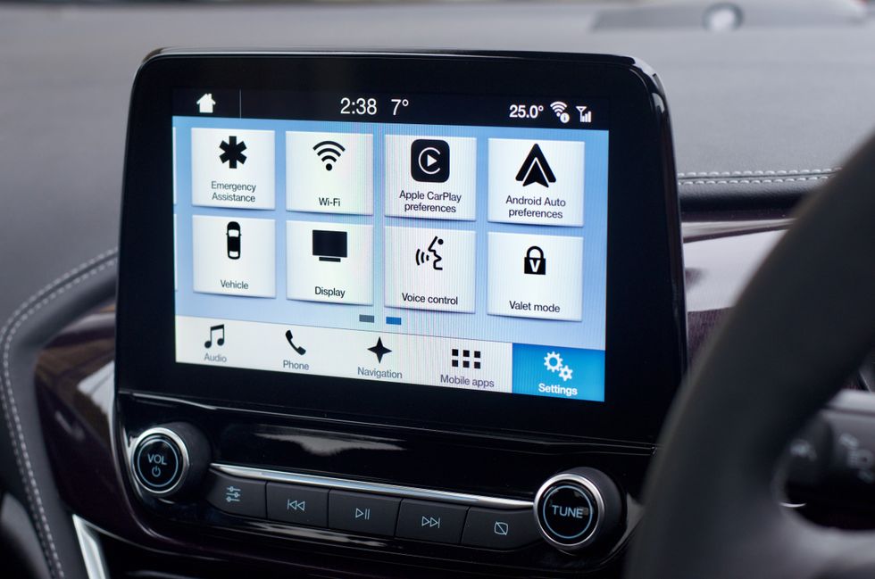 Ford Sync 3 isn't beautiful, but it is very simple to use at a glanceGearBrain
We are pleased to report, though, that once you use it, Sync 3's stripped-down design makes perfect sense. Where Tesla, BMW and Land Rover are sometimes guilty of confusing the driver with too many options, buttons, and few words to explain what each icon means, Ford Sync takes a simpler, pragmatic approach.
At the heart of this simplicity is a simple fact; this system is designed to be used by someone driving a car. It is not intended to be attractive, with neat animations, polished corners and Easter Egg gimmicks. Instead, the system is simple, functional, and easy to use at a glance. Sync has brought an entirely different approach to user interface design — and comparing it to a smartphone would be a mistake.
There is one similarity, though, between Sync and smartphones: speed. From our first try on the Fiesta's 8-inch screen we were immediately impressed by Sync's responsiveness.
 The 8-inch screen is large without dominating the dashboardGearBrain
You can tap the screen as lightly as an iPhone and it responds just as quickly. Menus pop up in an instant, the navigation keyboard is as speedy as an Android's, and the whole system feels light years ahead of those fitted to some far more expensive vehicles. Like the iPhone X's notch, Sync 3's unattractive UI is quickly forgotten about.
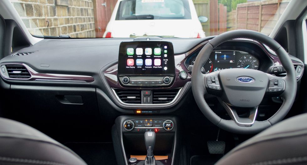
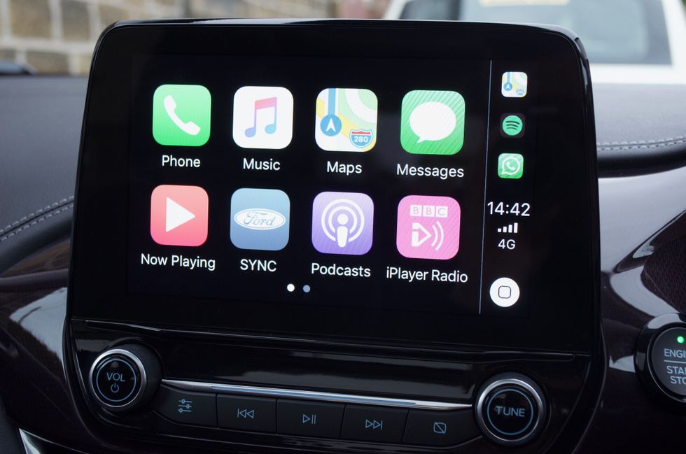
Pairing your smartphone via Bluetooth takes just a few moments. Sync 3 also offers both Apple CarPlay and Android Auto if you'd rather use those systems instead. Unlike BMW, CarPlay is wired-only, so we connected our iPhone via a USB port in a stowage bin beneath the central armrest. A second USB is placed just ahead of the gear lever, where there is also a 12V socket.
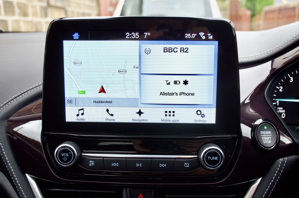 Sync's main screen shows media, connectivity and navigation at onceGearBrain
CarPlay works here just as it does on other cars, as the processing is done by the phone itself rather than the car's computer. With CarPlay you can use apps like Maps, Podcasts, Music and Spotify apps from your phone, plus Phone, Messages and WhatsApp. Some are navigated by touch, while others — like Messages and WhatsApp — can only be used by talking to Siri.
Additional volume and basic media controls are found on the steering wheel — handy, given the dashboard volume knob sits further from the driver than the dial to tune the radio. We found that strange.
The wheel also has a button for speaking to the car (or Siri and Google Assistant), cruise control buttons, and keys for navigating a second display between the speed and rev dials. We sometimes wished these buttons could control the touch screen too, as occasionally we felt reaching out to tap the display took too much of our attention from the road. We have no doubt muscle memory will help see to this with daily use, but we feel a secondary means of control — like the rotary dial used by BMW and Mini — would help.
For a small car, the new Fiesta is absolutely loaded with technology. Check all of the options boxes and you get a car with adaptive cruise control, automatic parking, pedestrian detection and automatic emergency braking, lane-keeping assistance, heated front seats and steering wheel, and a 10-speaker, 675-watt sound system by Bang & Olufsen which we were very impressed with.
![]() There are sometimes many buttons on screen at once, but using words instead of icons helps to keep things simpleGearBrain
There are sometimes many buttons on screen at once, but using words instead of icons helps to keep things simpleGearBrain
Much of this kit was standard on the Vignale version of the Fiesta that we drove. A luxury brand within Ford's European range, Vignale versions include leather seats and dashboard, plus exclusive wheels and front grille. By giving the Fiesta — consistently the UK's best-selling car — a touch of luxury, Ford is positioning itself against the Mini hatchback and Audi A1, appealing to buyers who want a small car for city center commuting, but have the budget to make the daily drive a more luxurious affair.
After a weekend and over 400 miles of driving, we only found two aspects of the Sync UI to be confusing. First, the icon to mute the navigation instructions is either blue or white depending on whether the voice has been silenced or not. However, the icon is of a speaker with a line through it, and has no writing, so without experimenting it isn't clear if blue is muted, or white.
Secondly, during a four-hour drive which began in bright sunshine and ended in darkness, we wanted to lower the brightness of the touchscreen. This required digging deep into the settings menu, which was a surprise given how it is likely something drivers will want to adjust regularly.
 Apple CarPlay and Android Auto are both includedGearBrain
But that's it. The rest of the user interface is clear, simple, intuitive and fast. It made us realize that, as good as polished graphics and smooth animations look on a TV advert or in the showroom, when on the road at 70mph we couldn't care less about how attractive the UI is — in fact, the less time looking at it, the better.
Verdict
Ford Sync 3 is not the most attractive infotainment system on the market. But once you start using it you realize how inconsequential aesthetics are when your attention is better spent on the road ahead. Stripping away unnecessary polish leaves a system which is as intuitive as it is responsive, but one which also offers the powerful functions of CarPlay and Android Auto to those who want them.
Pros:
Cons:
GearBrain Compatibility Find Engine
A pioneering recommendation platform where you can research,
discover, buy, and learn how to connect and optimize smart devices.
Join our community! Ask and answer questions about smart devices and save yours in My Gear.